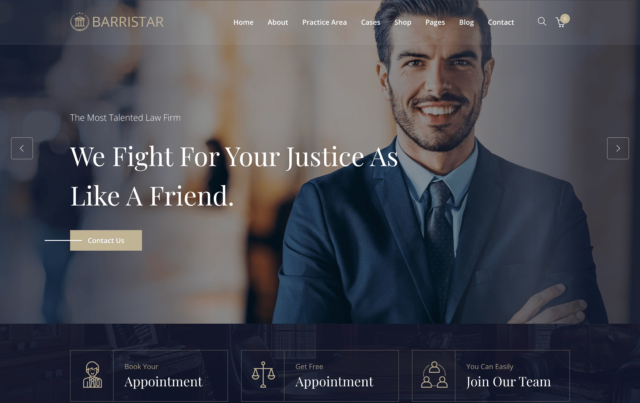
Your law firm’s website isn’t just an online placeholder – it’s a vital part of your marketing strategy and often the first impression potential clients have of your firm. If your website is outdated, confusing, or poorly optimized, it could actively discourage prospective clients from contacting you. Worse, it may be costing you valuable leads without you even realizing it.
Here are the most common website mistakes that drive visitors away—and what you can do to fix them.
1. Slow Loading Times: The Silent Conversion Killer
The Problem:
Studies show that 53% of users will abandon a website if it takes more than 3 seconds to load. For a law firm, this could mean losing clients before they even see your homepage. Slow-loading sites signal unprofessionalism and frustrate users looking for quick information.
Example:
A personal injury law firm in Chicago experienced a high bounce rate because their homepage, filled with oversized images and unoptimized video, took over 5 seconds to load.
The Fix:
- Compress images and videos to reduce file size.
- Enable browser caching and use a content delivery network (CDN) to speed up load times.
- Test your website speed using tools like Google PageSpeed Insights or GTmetrix.
2. Poor Mobile Optimization
The Problem:
Over 60% of legal service searches happen on mobile devices, yet many law firm websites are difficult to navigate on smaller screens. If potential clients have to pinch, zoom, or struggle to find information, they’ll likely leave.
Example:
A family law firm in Texas lost leads because their mobile site lacked a clear call-to-action (CTA) button, and their contact form was nearly impossible to complete on a phone.
The Fix:
- Use a responsive design that adapts to any screen size.
- Include mobile-friendly CTAs, such as a clickable phone number or “Request a Consultation” button.
- Test your site on multiple devices to ensure a smooth experience.
3. Lack of Clear Calls-to-Action (CTAs)
The Problem:
Visitors won’t take the next step unless you guide them. Websites without clear CTAs leave users unsure of what to do, reducing the likelihood they’ll contact you.
Example:
A criminal defense firm in New York had excellent blog content but failed to include CTAs like “Contact Us Today for a Free Consultation” at the end of posts, resulting in low engagement despite high traffic.
The Fix:
- Place prominent, action-oriented CTAs throughout your site, such as:
- “Schedule a Free Consultation”
- “Call Us Now”
- “Learn More About Your Case”
- Use contrasting colors for CTA buttons to draw attention.
- Ensure every page has a clear next step for users to take.
4. Outdated or Unprofessional Design
The Problem:
Your website’s design directly impacts how potential clients perceive your firm. An outdated or cluttered design can make your firm seem unprofessional or out of touch.
Example:
A bankruptcy attorney’s website featured clashing colors, stock photos, and excessive legal jargon. Prospective clients didn’t trust the site enough to contact the firm.
The Fix:
- Use a clean, modern design with consistent branding.
- Avoid stock images of gavels and scales, opting instead for professional photos of your team and office.
- Keep the navigation simple and intuitive, with easy access to practice areas and contact information.
5. Neglecting SEO Best Practices
The Problem:
If your website isn’t optimized for search engines, potential clients may never find it in the first place. Poor SEO practices—such as duplicate content, lack of local keywords, or slow page speeds—can tank your search rankings.
Example:
A small estate planning firm in Florida didn’t include location-specific keywords in their content, missing out on local searches like “wills and trusts attorney in Miami.”
The Fix:
- Include local keywords in titles, meta descriptions, and headings (e.g., “Top Personal Injury Lawyer in Dallas”).
- Optimize your content for voice search by answering common client questions in conversational language.
- Regularly update your blog with relevant topics to improve your site’s authority.
6. Failure to Build Trust
The Problem:
Clients want to know they can trust you before they reach out. Websites that lack trust signals—like testimonials, case studies, or professional affiliations—miss the opportunity to establish credibility.
Example:
A corporate law firm in Seattle had no client reviews or visible certifications on their website, leaving visitors uncertain about their reputation.
The Fix:
- Display client testimonials prominently on your homepage.
- Include badges or logos for professional memberships, awards, and certifications.
- Publish anonymized case studies that demonstrate your firm’s success.
7. Confusing or Cluttered Navigation
The Problem:
If visitors can’t find the information they need quickly, they’ll leave. Complex menus or poorly organized content create frustration and increase bounce rates.
Example:
An immigration law firm in Los Angeles had a cluttered navigation bar with too many options, making it difficult for users to locate their specific services.
The Fix:
- Simplify your navigation bar to include only essential sections, such as “Home,” “Practice Areas,” “About Us,” and “Contact.”
- Add an on-site search bar to help users find what they’re looking for.
- Use breadcrumbs to show users where they are on the site.
Your website is often the first interaction a potential client has with your law firm. If it’s slow, confusing, or outdated, you risk losing leads to competitors with a better online presence. By addressing common mistakes—such as poor mobile optimization, lack of CTAs, and outdated design—you can create a website that builds trust, engages visitors, and converts them into clients.
Your website should be your strongest marketing asset, not a liability. Take the time to evaluate your site today and ensure it’s working for you, not against you.


