A law firm’s website serves as its virtual front door, often forming the first impression for potential clients. Beyond content and functionality, the design elements—colors, fonts, and layout—play a pivotal role in shaping client perceptions and influencing conversion rates. Understanding the psychology behind these design choices can empower law firms to create websites that not only attract visitors but also convert them into clients.
1. The Impact of Color Psychology
Colors evoke emotions and can significantly influence user behavior. For law firms, selecting the appropriate color palette is crucial to convey professionalism, trustworthiness, and competence.
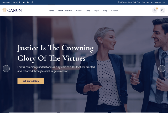
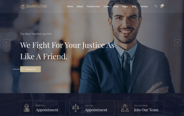
- Blue: Widely associated with trust, security, and professionalism, blue is a prevalent choice for law firm websites. Approximately 45% of the largest U.S. law firms incorporate blue into their web design, leveraging its calming and trustworthy connotations.
Source: EverConvert
- Gray: Symbolizing neutrality and formality, gray is often used as a background color, allowing other elements to stand out while maintaining a sophisticated appearance.
- Green: Representing growth, harmony, and stability, green is suitable for firms emphasizing environmental law or aiming to convey a balanced approach. Its association with nature can also evoke feelings of calmness and renewal.
Source: Jurisdigital
- Red: Conveying passion and urgency, red can be effective for call-to-action buttons, prompting immediate responses from visitors. However, it should be used sparingly to avoid overwhelming users.
Best Practices:
- Consistency: Ensure that the chosen color scheme aligns with the firm’s branding across all platforms.
- Contrast: Use contrasting colors for text and backgrounds to enhance readability and draw attention to key elements.
- Cultural Sensitivity: Be mindful of cultural differences in color perception, especially if serving a diverse clientele.
2. The Role of Typography
Fonts do more than display text; they communicate the firm’s personality and influence readability.
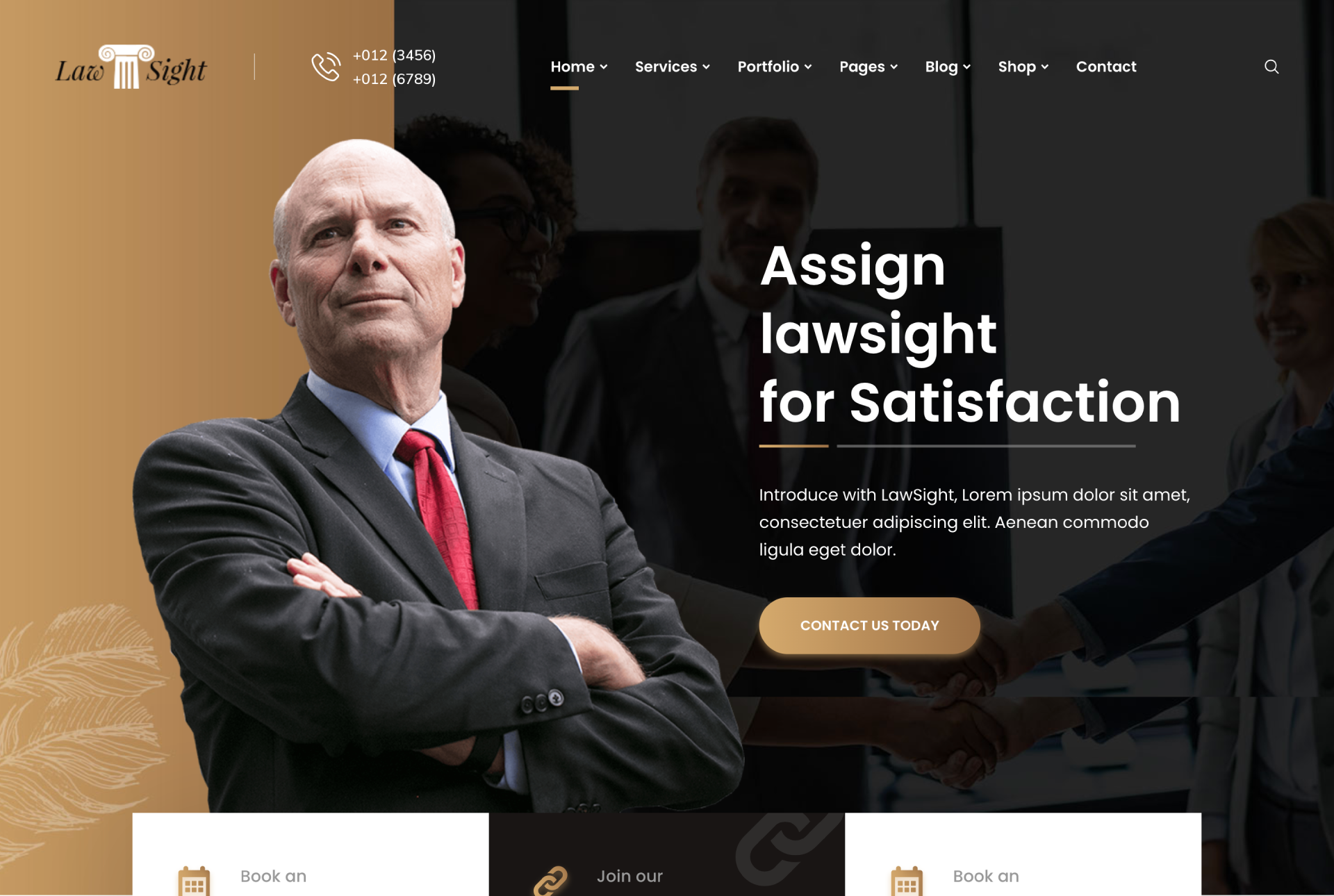
- Serif Fonts: Characterized by small lines at the ends of letters, serif fonts exude tradition and reliability. They are commonly used in legal documents and can lend an air of authority to a website.
- Sans-Serif Fonts: Modern and clean, sans-serif fonts are easier to read on screens and convey a contemporary feel.
Best Practices:
- Readability: Prioritize legibility by choosing clear fonts and appropriate sizes.
- Hierarchy: Utilize different font sizes and weights to establish a visual hierarchy, guiding users through the content seamlessly.
- Limit Variety: Stick to two or three complementary fonts to maintain a cohesive and professional appearance.
3. The Influence of Layout and Design
The website’s layout affects user experience and can significantly impact conversion rates.
- Navigation: Intuitive navigation ensures users can find information quickly, reducing frustration and increasing the likelihood of engagement.
- Whitespace: Strategic use of whitespace prevents clutter, making the site more approachable and highlighting essential elements.
- Visual Hierarchy: Organize content to lead the user’s eye naturally from one section to the next, emphasizing calls to action.
Best Practices:
- Responsive Design: Ensure the website functions seamlessly across all devices, as a significant portion of users access sites via mobile.
- Load Time: Optimize images and other elements to reduce load times, as slow websites can deter potential clients.
- Accessibility: Design with accessibility in mind, accommodating users with disabilities to broaden your reach and comply with legal standards.
4. Data-Driven Design Choices
Empirical evidence supports the impact of design elements on user behavior.
- Color and Conversion: Studies indicate that color can influence up to 90% of a consumer’s initial assessment of a product or service. For instance, using contrasting colors for call-to-action buttons can increase conversion rates by drawing attention to them.
- Typography and Trust: Research suggests that fonts affect perceptions of credibility. Serif fonts are often associated with reliability, while sans-serif fonts are viewed as modern and approachable.
- Layout and Engagement: A well-structured layout with clear navigation can reduce bounce rates and encourage users to spend more time exploring the site.
5. Case Studies: Effective Design in Law Firm Websites
- The Modern Firm: Utilizes a blue and gray color scheme to convey stability and reliability, with a clean layout that enhances user experience.
- Ruth Law Team: Incorporates blue to represent trust and security, with a straightforward navigation menu that guides users effortlessly.
Source: Jurisdigital
The psychology of colors, fonts, and layout plays a crucial role in designing a law firm website that not only attracts visitors but also converts them into clients. By thoughtfully selecting design elements that align with your firm’s brand and resonate with your target audience, you can create a digital presence that exudes professionalism, builds trust, and encourages engagement. Investing in a user-centric design is not merely an aesthetic choice but a strategic decision that can significantly impact your firm’s success in the digital landscape.


